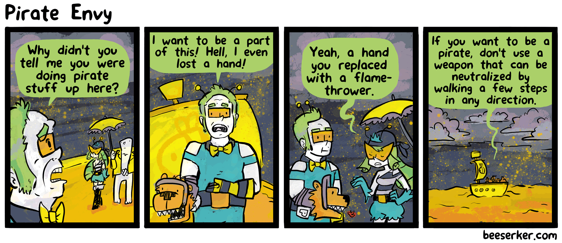
I’ve been fooling around with some brushes lately. I’ve also been fooling around with some code lately – namely, the code for this comic’s Flash-based cast page Super Cast Page!. It now includes Chelsea and Fairbanks!
Beeserker
The webcomic about a robot powered by bees

First!
The new brushes are certainly an interesting look. I do enjoy how reading this comic is a constant reflection of your art style at the moment in time.
Flamethrowers technically have more reach than swords or hook hands …
Also neither of those weapons would be very effective against bees, methinks.
It’s a team fortress flamethrower. A real one isn’t something you’d want to use near your bare skin.
But how do you get past 74 bees?!
Have you tried dancing a lot?
If you’re talking about the spot you can dance to get a bunch of the images of first panels of chapters, yes I’ve found that. The sequence of numbers resulting doesn’t seem to work anywhere (and it keeps turning off the sound since it includes 0)
Whoa it’s weird seeing brushes in this comic… it’s been so… solid so far.
ah man the cast page, that just reminds me once again about how I never got the last few bees.
Not sure about the new art style… might need to see a few good Sciencemen ripping to get used to it. (of course, I really just want to see the Sciencemen get ripped in half again)
Also, I don’t know if it’s the case here, but fire and pirate ships don’t mix well.
Hmm I dunno… I like that the art is getting more detailed, and I expect it to seem a bit stiff during the adjustment, but those first two panels do feel off.
… I’m sorry to be the first critical comment, but I really feel like the previous artwork was better. It might be less detailed but it felt “cleaner”, like, you know, it’s easier on the eyes when there’s no brush around. Still love the writing so I’ll keep on reading no matter what, but I’m starting to feel old thinking “in my times this was better!” Fuck I’m getting old now that I think about it…
A flamethrower is still useful if it forces people to abandon ship. You could also easily destroy the ship itself if you needed to.
It’s not a wooden ship in this case, but wax melts easily so the point still stands.
As for the painting style…. It doesn’t bother me at all. This comic started with the stipulation of having a strict color palette, which meant no color-blending, so it was always kind of experimental. Experimenting is cool! I’ve been reading for a while and it’s not the first time that the comic has gotten a style change. It’s interesting to see how blending colors creates new options while still having some limitations on the available colors. I do have one question, though: Did people react this way the first time you added to the color palette? (hehe)