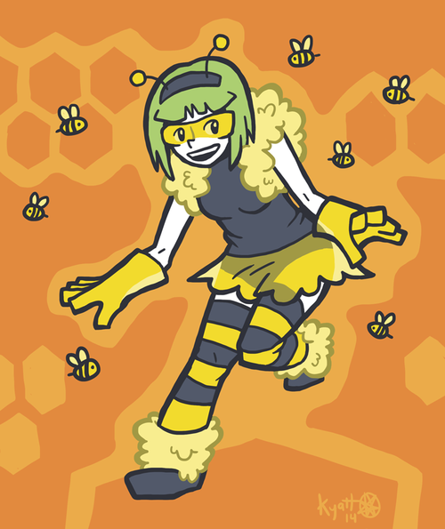
Hiveworks, the webcomic group I’m associated with, is changing its logo to something more legible than that diagonal text thing that you might’ve seen on this site’s right sidebar for the last few years. Creators of some of the other comics have been drawing bee versions of their characters to put in the center of the logo, and I wanted a part of that. It was a challenge, but I think I managed to make Trigona look slightly more bee-like.


Is there alt text on this one? I can’t see it.
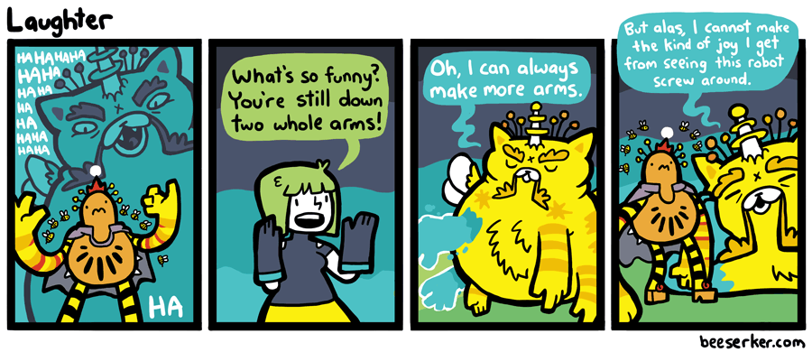
also, I just realized that the perfect voice for the giant cat thing (I forgot it’s name) Is Zinyak’s voice from Saint’s Row 4.
There should be alt text there.
As for CSX’s voice, yeah, I do kinda picture it in my head like that, except with less heavy of an accent. Same echoey contempt, though.
Trigona looks awesome.
Seconded, that’s a neat outfit. Begoggled Trigona is the best Trigona.
It’s so awesome that I hope she’ll get it as a new costume in the comic.
haha.. whenever enemies laugh instead of being scared, i always wonder if that’s forced.. if they had to think of something funny.. or if they just have weird senses of humor.
D’aaw, what a jolly galactic space demon.
He’s like a giant Santa Claus made of evil bees.
Everyone else must be thinking it too, but I’ll be the one to say it:
Bad choice of words there, time for you to get “screwed around” by Beeserker!