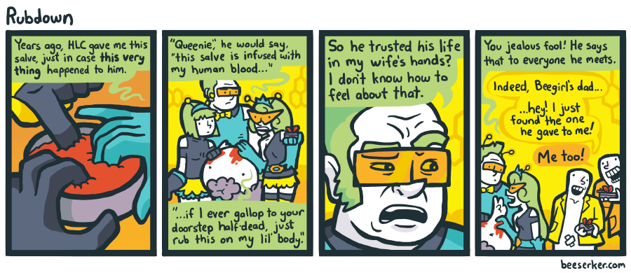
I got a lot of feedback on the “dark blue vs. black” issue I brought up on Tuesday, from both sides, which were just about even in numbers. For the time being, I’m going to stick with dark blue. Don’t worry, Team Black – for all I know, this may just be a phase I’m going through, kinda like all those halftones I used in the early strips.
I actually went with a darker blue this time, because the text wound up being a bit small, and I needed a bit more contrast.

It’s a good thing most of them wear gloves 😛
And in the sciencemen’s case, any form of bodily harm is horrendously temporary.
But… she said… “I can’t believe this happened to you AGAIN”…
Yellow’s speech bubble is good. It still fits with everyone else without having to change the background every time he speaks. Have you done that before?
I do enjoy how HLC’s ear/arm is doing a little peace sign. It’s like: “I got my handsome lil’ fingers back!”
but the >.< face is what makes it all the much better
I’ve done it with other yellow objects (usually the antennae), but I don’t think I’ve done it with the speech bubbles yet.
Is that second shade of green in Mel’s hair new?
Yeah, I gave each color a correspondent shadow since last strip. This might not stick, especially if there’s significant backlash over me doubling the palette of the comic.
It’s cool, as long as you use it sparingly. Like you are. So Yeah.
Hmm. I’m undecided on the blue/black. I kind of like the soft look of the blue, but I also like the contrast of the black. I think the darker blue used here helps significantly, though.
Whichever you pick, you should continue to use black at times – like, say, the second panel of “mourning”.